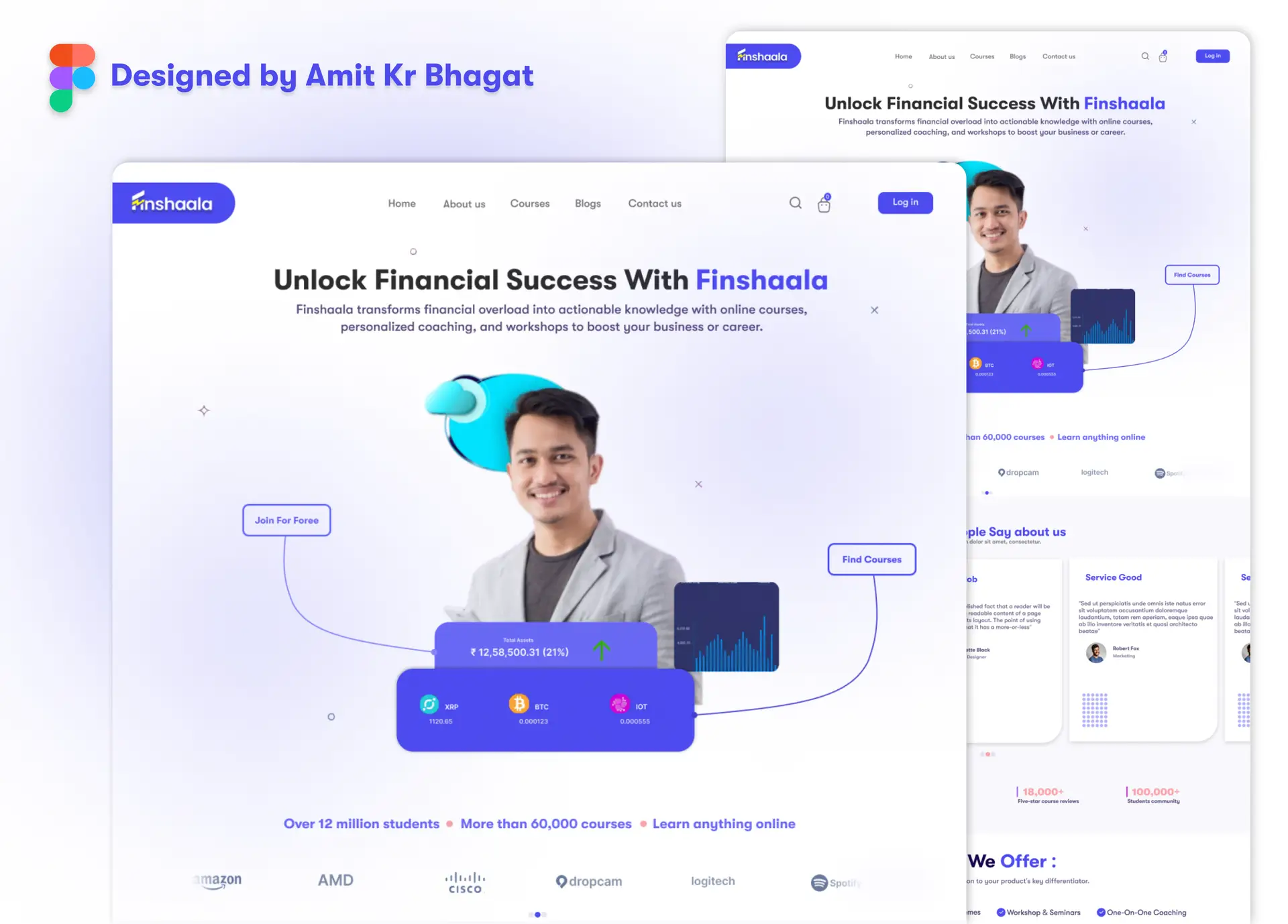
Project Overview:
This project involved a creative redesign of the Finshaala website, showcasing my ability to enhance an existing design with modern aesthetics and improved user experience. The primary goal was to refresh the site’s look while ensuring it better serves Finshaala’s target audience through a more engaging and functional layout.
Key Features:
Modern and Clean Aesthetics: The redesign introduces a fresh, minimalist look with a focus on white space and clean design elements. This approach creates a visually appealing and easy-to-navigate interface, enhancing the overall user experience by eliminating clutter and emphasizing important content.
Enhanced User Experience: Significant improvements were made to the user flow by reorganizing key sections such as course offerings, testimonials, and calls to action. The new layout is crafted to guide users effortlessly through the site, allowing them to find relevant information quickly and efficiently, thus improving overall usability.
Vibrant and Cohesive Color Scheme: The redesign features a vibrant yet professional color palette. Consistent use of colors and typography helps to strengthen the brand’s identity and creates a cohesive visual experience, ensuring that the website’s appearance aligns with Finshaala’s branding strategy.
Responsive Design: The design ensures a fully responsive experience across all devices, including desktops, tablets, and mobile phones. This adaptability guarantees that users have an optimal viewing experience, regardless of the device they are using.
Interactive Elements: To increase user engagement, dynamic content such as sliders, call-to-action buttons, and hover effects were integrated. These interactive features enhance the site’s functionality and make the browsing experience more engaging and enjoyable for users.
Design Tools:
- Figma was utilized extensively for wireframing, prototyping, and designing the new layout. This tool enabled a smooth design process and allowed for precise adjustments based on feedback.
Conclusion:
The Finshaala website redesign project demonstrates my creative approach to modernizing existing designs, focusing on both aesthetics and functionality. The result is a contemporary, user-friendly website that effectively communicates Finshaala’s mission and offerings, providing an enhanced user experience that aligns with modern web design standards.

